So now that my actual assessment is over, I'll try to post more about yoga itself, rather than creating designs in photoshop. Enjoy xxx
I'm always open to new suggestions!
I'm always open to new suggestions!
So now that my actual assessment is over, I'll try to post more about yoga itself, rather than creating designs in photoshop. Enjoy xxx I'm always open to new suggestions!
0 Comments
This week, I began by designing a final collection consisting of a colour palette of hot pink, whites, greys and a staple of black. Outfit 1: 3/4 black stretch leggings made from Lycra. Hot pink sports bra White stretch tank with hidden support (for style, comfort and durability) Outfit 2: Basic black yoga pants Wide-strap black support sports bra in black Oversized charcoal tee Outfit 3: Black sports crop with grey under banding Grey 3/4 leggings with hot pink stretch waistband Outfit 4: Hot pink sports crop Ombre effect 3/4 leggings (done using the gradient tool) Outift 5: Yoga black 'bike' shorts Mesh decoletage & black corset-style bodice  Outfits In Descending Order 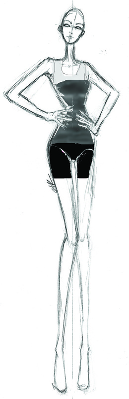 Outfit 5 - Adding Last Minute Extra Design From this, I am leaning towards outfit 1 for my final design and the outfit I would like to create.
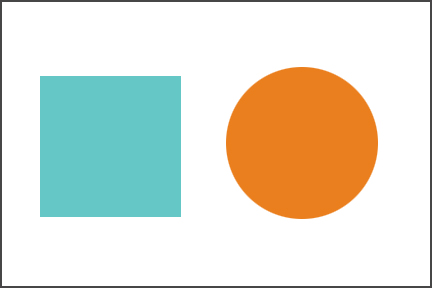
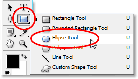
Week two of design and experimentation has been a fairly successful one. It consisted mainly, on the completion of experiments, and the beginning of designing an actual clothing line. Shown below, is the evolution and repetition of the same croquis done simply, by creating new layers and placing one on top of the other (where applicable). In this case, it will be used as a background for the fashion garment(s) about to be added over the top. 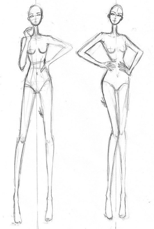 Original Croquis Image 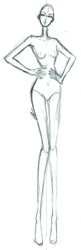 Cropping To Leave Only One Mannequin 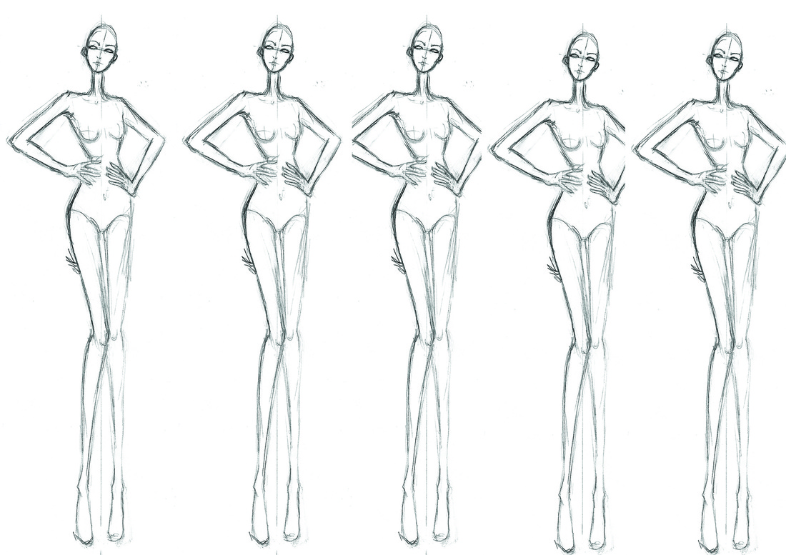 Manipulating Different Layers 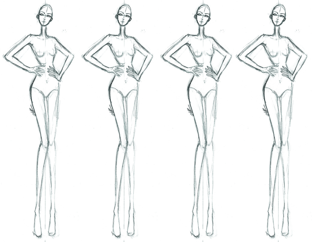 Final, Desired Placing of Multiple Layers After learning how to crop, insert and adjust multiple layers, the class then moved onto designing an actual garment in Photoshop. Here, is an example of using the ‘pencil’ tool to simply draw the outline of a garment. (NOTE: it can also be done using the ‘paintbrush’ tool). In other cases, such as the upcoming one, the 'magnetic lasso' tool makes going over a previous outline all that easier as it just grabs (or is 'magnetised') to the sketch. It can then be filled by using the ‘fill bucket’, or by entering in a pattern which another example will convey later. 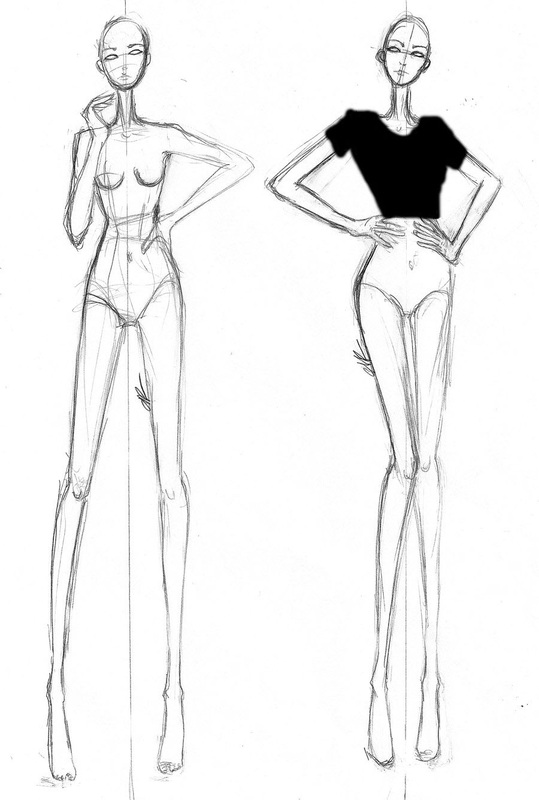 Free-hand Drawing to Create a Garment (t-shirt example) From figuring out how to design a garment and use different 'filling' techniques, a greater use of these could then be demonstrated. For example, the exercise below of an 80's style bodysuit with a paisley pattern as the fill. Starting with a basic croquis and using a pencil to outline the desired shape, I could then open a new page and insert a pretty pattern for adjustments. 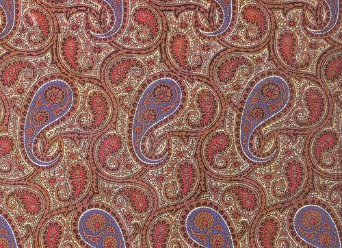 Basic Paisley Pattern Through selecting the different 'fill' options, I could then use the pattern I had already adjusted to fill the outline of the bodysuit I had just roughly drawn. The next task was to adjust the scale of the same pattern image and place it on the mannequin beside the first example, as shown below. 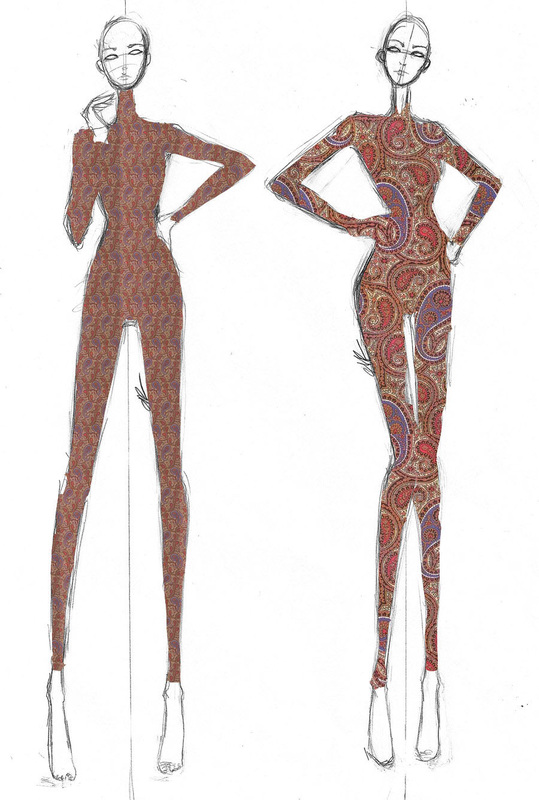 Smaller-Scaled Pattern to the Left & Original Scaling to the Right - Using the Magnetic Lasso Tool Also this week, we discovered how to manipulate the colours of a garment by using the dodge and burn tool. The dodge tool essentially, lightens or highlights specific areas and the burn... obviously creates a 'burnt' effect; darkening the desired areas. 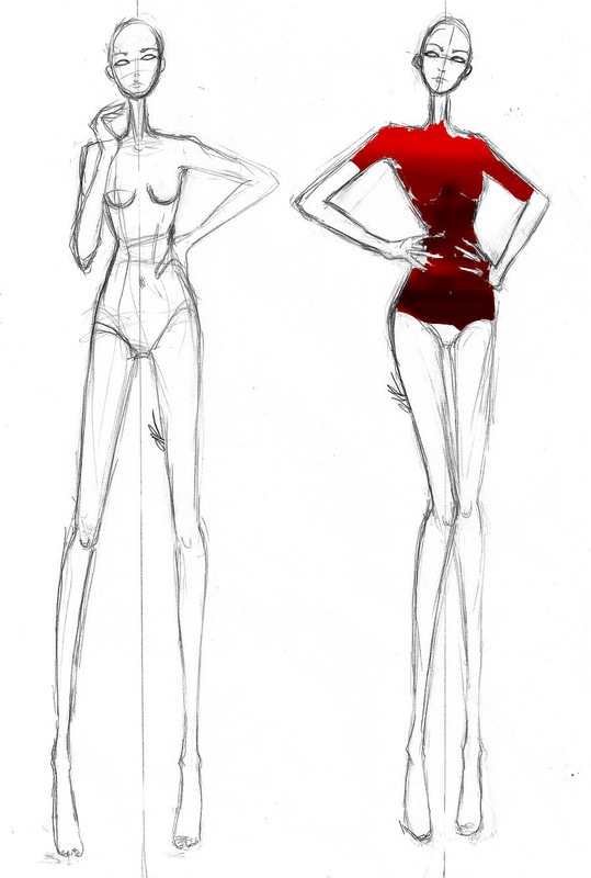 Dodge & Burn Techniques There's always a sudden realisation when one first decides what to create for a range of sportswear garments. That is, "what is it I should create?!". Oh, and "where on earth should I begin?". Week 1 has been a successful week in which I have completed the "Sports Web Research" sheet and also visited the Mont Adventure Equipment Factory in Fyshwick, ACT. It was extremely insightful to view how such garments are constructed, and because of this, I am now aware at why pricing is the way it is. Shortly after visiting the factory, I completed the "Mont Excursion Review" sheet (both are attached to this site). After researching and gaining some aspect of the construction of some sportswear, it was time to begin designing some of my own. The class' first exercise was to open up a basic sketch of a croquis within Photoshop. After opening up a separate new page, it was time to start using the 'ellipse' and 'square' tools to create different shapes. I then used the 'fill bucket' tool to enter different colours as shown below.
Next, it was time to time to create 3 squares with an ombre effect by using the 'Magic Wand Tool' and then by adjusting the gradient by using the 'Gradient' tool (placed underneath the fill bucket when right-clicked).  Copying & Multiplying, Then Isolating 3 Squares, Then Adding the Ombre Effect Then, after choosing a suitable pattern, I learnt how to alter the effects, contrast, brightness etc of an image; as shown below. 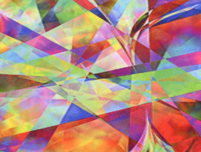 Original Image 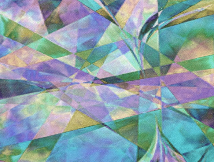 After Adjusting Contrast 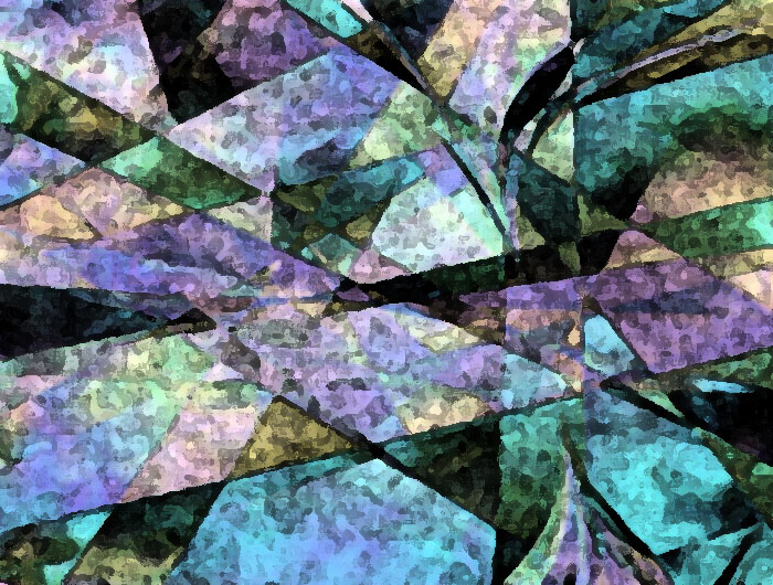 With 'Fresco' Effect Applied |